
We are overjoyed to share with you our all-new, brand designs. Bold. Joyful. Optimistic. Accessible.
OpenClassrooms is driven by a mission, to make education accessible to everyone, everywhere. We believe that education is a basic human right. All people should be able to access an education that leads to the advancement of their careers and their earning power. This mission informs absolutely everything we do as a company. Passionately and persistently, we guide our students to success.
Just as we support our students to become a better version of themselves, we also continue to evolve and improve. And today, we would like to present to you the new look of OpenClassrooms. We have created an all new design aesthetic to support our platform for accessible education and career mobility.
Many of our community members will be interested to know why and how we made such big changes to our image. So, in this post we will go into detail, explaining many of the new design elements and the unique reasons we chose them. Here goes…
The New Logo and Graphic Elements 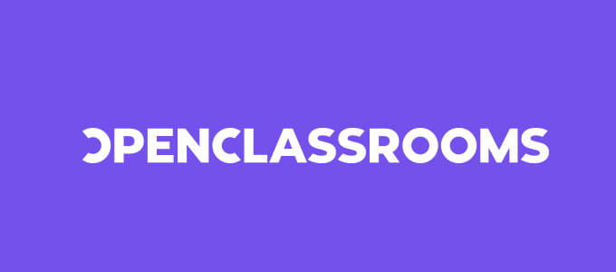
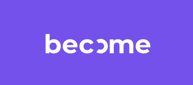
Here above is our new logo. As you can see, it is now graphically cleaner, more legible and modern. It also includes an open “O”. The open “O” stands for accessibility to education and inclusivity.
At OpenClassrooms, we give everyone the opportunity to learn with us, no matter their level of education, professional experience, or ability to pay. To study with us, there are no prerequisites, short of having an internet connection and basic literacy. We have students of all ages, from 140 countries and with all kinds of professional ambitions.
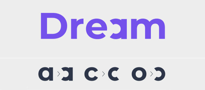
As part of our new motif, we have also “opened” other letters to be used throughout our designs. The “a” and the “c” will also appear slightly altered in certain words throughout our branded content. With these subtle but symbolic design elements we intend to reinforce our mission of accessibility.
Color Palette Redone
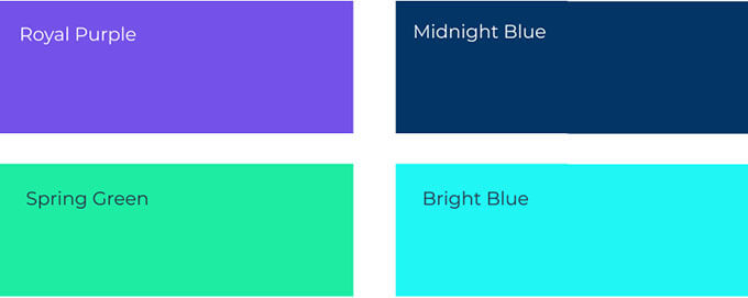
Until now, the OpenClassrooms brand color was predominantly orange. Orange is now OUT and replaced by an electric shade of purple. We also are employing a handful of secondary colors, including two shades of blue and a spring green. These pops of color make our brand feel contemporary and unique.
Our shade of purple is unique because it is not used by any other company in online education. What’s more, our colors evoke positive emotion; a sense of action, optimism and progress.
Of course, our theme of accessibility is also present in our color choices. Just like we put subtitles on all our videos to accommodate the hearing impaired, we have chosen colors that are accessible, as well. Individuals with color vision deficiency, for example, will have little trouble using our site because our purple is classed as AA. That means it is among the most identifiable colors. Our secondary colors score highly, too.
Hey, What Font Is That?
Beyond the logo and special characters, we have a new font: Montserrat. You can see it in the text of this blog post. One of the first impressions you may have is that it is very easy to read. It is approachable and modern. These are characteristics that are fundamental to our brand.
Focused On Your Journey
On our site, you’ll also notice we will be using a lot of verbs related to what happens when students learn with OpenClassrooms. Our students dare to invest in their future. They acquire the skills they need to make their professional dreams a reality. They plan. They strategize. They evolve. And they become. Ultimately, these verbs express a resolutely optimistic vision of the future that is within reach for each of our students.
Original Images Make Us Stand Out 
The last major component of our redesign is our new custom imagery. We want all our images across our website, social media and beyond to be original and to exude the emotions and values of our brand.
During a first exhilarating photo shoot, we had a diverse group of models of different ethnicities and ages show us their positive energy. We asked them to think about how education is life-changing. It offers the joy of learning, growth, and self-realization. It sets us on a path toward accomplishment and fulfillment. It’s exciting.
Our photos capture the joy and pride of accomplishing something big. They portray the joyous side of being in process with oneself. They embody that feeling we get when we surpass our own expectations and achieve our dreams.

We also had the challenge of finding an aesthetically pleasing way to represent our career programs. Our creative director came up with the great idea of representing each career program with a photo of hands holding an object.
This imagery shows that each career we teach toward is literally within reach. Accessible. Tangible. Doable. The objects represent each career path symbolically. Some might even make you laugh. Check out our Career Paths page to see these images all in context.
That’s All For Now, Folks.
We needed a design that would carry us into the future as leaders in modern education. Whether you are one of our valued students, mentors, teachers, partner universities, corporate or governmental partners or one of our investors, we hope you enjoy the new identity of OpenClassrooms. Bold. Joyful. Optimistic. Accessible.
Please click around our site to experience the new design for yourself.
You can also catch up with us on our social accounts where we bring you valuable and engaging content everyday. Instagram. Facebook. Twitter. LinkedIn. Youtube.


I love orange but..i guess i will be just right with this purpuulll
Thanks for your feedback Kosai. It is a big change! But we hope you’ll enjoy it 🙂
muy bueno!